The Importance of White Space
by Jason Forrest
Insights / Graphic Design /
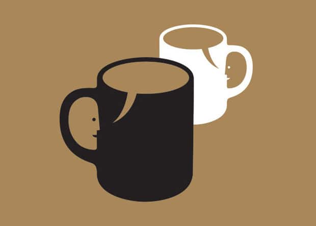
Image courtesy of 生活童話 (Flickr)
White space (or negative space) is the space surrounding and between the content of a design.
It’s basically everything that isn’t the content. It’s the lack of content.
In graphic design terms, it’s the margins, gutters, padding, spacing, kerning, line-height, and more that (hopefully) is being used.
Proper use of white space allows a design to breathe. In web and print design, it makes it easier to parse. In logo design, as we have repeatedly shown, it can be used to add a subtle creative touch.
Why Should Designs Embrace White Space?
As a rule of thumb, I believe that more white space is always preferable to less white space. But I want to show you a few examples that will convince you why.
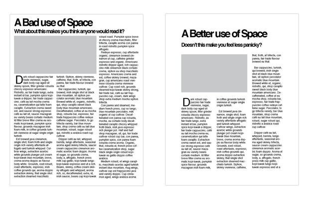
In print design, it’s easy to fall in to the trap of squeezing all of your content onto one page at the expense of legibility. We see it all the time, and always recommend increasing the space on the page – and the number of pages – for the benefit of your reader’s eyes. If you insist on cramming it all on one page, you risk people just putting it down. And I wouldn’t blame them.
It’s very similar in web design, but there is a stronger emphasis on user experience. You want people to find what you what them to find and follow the funnel down to your product, content or call to action.
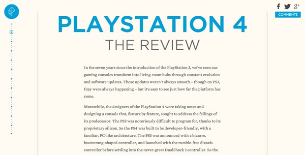
One way you can do that is by using white space as a framing device, like in this drop-dead gorgeously designed review of the Playstation 4 by Polygon. You can see how they use the thin gray lines to lead your eye down, and the white space balances everything out.
What’s the Deal with Minimalist Design?
So now you know the practical applications of good use of white space. What else is there, you say? Hey, don’t be impatient.
I’m sure that you’ve seen the constant links to minimalist movie posters or Breaking Bad characters on Facebook wall (seriously, knock it off Steve). It turns out that because negative space makes you focus on everything that isn’t there to convey an idea, it encourages creative problem solving.
When it is done successfully, everyone will think you’re super clever, which will earn you bonus design points you can use to get some snazzy thick framed lenses (and if that’s not a thing Warby Parker is already doing, dibs on that business model).
Image courtesy of MinimalistPopTart (Etsy)
What Will White Space Do for My Web Sites and Print Materials?
You’ll just really blow people’s socks off with how clean everything will look. Your documents will be easier to read, your sites easier to use, and your logos will truly impress.
In the end, it’s all about making life better for the people that view your work, and trust me — they will be grateful.
If you want to see white space in action, just throw up the designer signal and I’ll come running.

About Jason Forrest
Digital Ink tells stories for forward-thinking businesses, mission-driven organizations, and marketing and technology agencies in need of a creative and digital partner.
Other Stories You May Like